Curve Fitting in Excel: A Tutorial on Fitting a Complex Nonlinear Regression Model to Your Data
Introduction
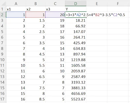
In this tutorial, we will fit the coefficients a0, a1, a2, a3 and exponents b1, b2, b3 of the following nonlinear regression equation to the data consisting of 17 measurements of the dependent variable Y and three independent variables, x1, x2, and x3:
Y = a0 + a1x1b1 + a2x2b2 + a3x3b3 (1)
Usually, the goal of curve fitting is to develop an equation between the independent variables and the dependent variable, where the values are typically the result of measurements. However, the goal of this study is to determine whether Excel and the ndCurveMaster software can discover the above equation solely based on the numerical values of all variables, without knowledge of their true relationship. Therefore, in this tutorial, the values of Y were calculated using the following exponential equation:
Y = 3 + 3x12.5 + 4x23 - 3.5x30.5 (2)
This knowledge of the true relationship between the variables described by equation (2) will allow us to compare the discovered equations obtained through the curve-fitting process and evaluate the accuracy of using Excel and ndCurveMaster.
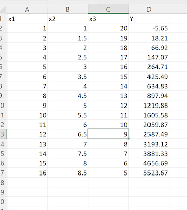
To begin, create four columns in your Excel spreadsheet to house the variables x1, x2, x3, and Y:
Implementing the Best Fit Curve in Excel
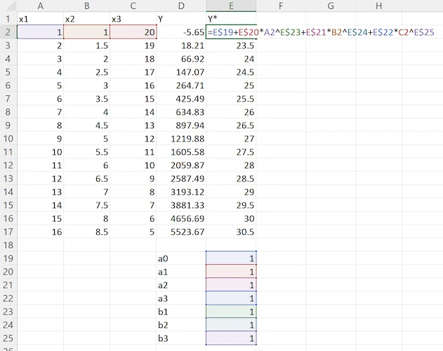
In this section, curve fitting will be parameterized using regression coefficients and exponents. Add cells for coefficients a0, a1, a2, a3, and exponents b1, b2, b3, initially setting them to "1". Create a column labeled Y*, calculated based on x1, x2, x3, coefficients a0 - a3, and exponents b1 - b3, using formula (1), as follows:
Implementing Least Squares for Finding the Best Fit
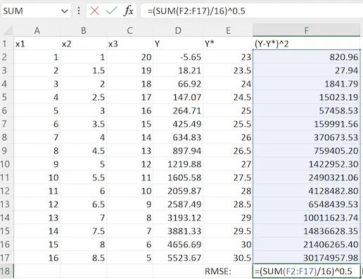
To measure the accuracy of our estimation, we will employ the Root Mean Square Error (RMSE), calculated as follows:
RMSE = √(Σ(Y(i) - Y*(i))^2/n) (3)
RMSE quantifies the differences between actual data (variable Y) and the estimated values (Y*). A lower RMSE indicates a better fit. In our tutorial, RMSE is used as the criterion for curve fitting.
Create another column, (Y - Y*)^2, to calculate the squared differences between Y and Y* using (D2 - E2)^2. Sum these values (in column F), divide by n=16, and calculate the square root using formula (3) to obtain the RMSE error. The figure below shows the sheet with the formula:
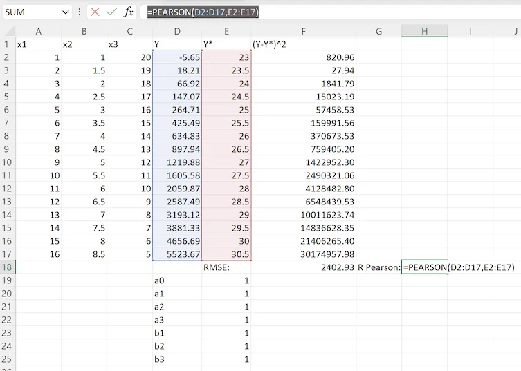
You can also add the Pearson Correlation Coefficient using Excel's formula:
=PEARSON(D2:D17, E2:E17)
Using Solver for Nonlinear Curve Fitting
Now, we will proceed with curve fitting. Follow these steps:
- Add the Solver add-in to Excel.
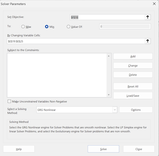
- Open Solver and:
- In the "Set Objective" field, select cell $F$18 (this contains the RMSE values).
- In the "To" option, choose "Min" to minimize RMSE.
- In the "By Changing Variable Cells" field, select the model coefficients and exponents in cells $E$19:$E$25 (set initially to "1").
- Uncheck the "Make Unconstrained Variables Non-Negative" option to allow negative values.
- Keep the "GRG Nonlinear" search method.
Below is the window with all the settings:
To perform curve fitting in Excel, click the "Solve" button. Once you've clicked it, the Solver will calculate the coefficients and exponents of the model, minimizing the RMSE value in cell F18. Click "Solve," and a window should appear:
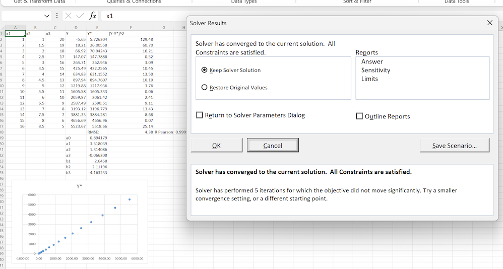
In the background, you can already see changes in the model's coefficients and exponents, and the scatter plot looks promising. Click "OK" in this window to complete the curve fitting process. Below is a table showing the optimal model coefficients:
- a0: 0.894179
- a1: 3.518039
- a2: 1.314086
- a3: -0.066208
- b1: 2.6458
- b2: 2.11196
- b3: -4.163233
By introducing these coefficients into the regression equation (1), we obtain the following formula:
Y = 0.89 + 3.518 * x12.65 + 1.314 * x22.11 - 0.066 * x3-4.16
These coefficients are crucial for understanding the relationship between the variables and fitting the curve effectively.
You can download the spreadsheet illustrating the above solution from the link: Download the tutorial spreadsheet.
Results: Formula Accuracy Assessment
The solution's accuracy can be evaluated using RMSE, and Pearson's correlation coefficient. The RMSE is 4.38, and the Pearson correlation is 0.99999715.
However, this solution is not optimal. It did not discover equation (2), instead yielding:
Y = 0.89 + 3.518 * x12.65 + 1.314 * x22.11 - 0.066 * x3-4.16, which differs from the target formula (2):
Y = 3 + 3*x12.5 + 4*x23 - 3.5*x30.5.
Excel's optimization limited the solution to a local optimum. To discover equation (2), the ndCurveMaster program is required. Using a random search algorithm, ndCurveMaster found equation (2) with an RMSE of zero and a Pearson correlation of 1. The following sections explain how to use ndCurveMaster for such studies.
Curve Fitting with ndCurveMaster: Tips for Achieving Accurate Fits
The challenge we tackled demanded four-dimensional curve fitting. As you've seen, using Excel for this purpose delivered some pretty decent results. Now, let's stack these results up against those achieved with ndCurveMaster, a top-notch curve fitting tool designed for fitting functions with any number of variables.
You can download a trial version of the program for Windows or MAC from the following link: ndCurveMaster Download
Copy the values of x1, x2, x3, and Y to a new sheet, then save it to disk. The data should look like this:
Or download the file here: Download the spreadsheet.
Click "Advanced Search" to start a randomized search, using iterative methods to find the best model via nonlinear regression.
After 15 seconds, several solutions will appear. The best one is:
Y = 3 + 3 · x12.5 + 4 · x23 + (-3.5) · x31/2
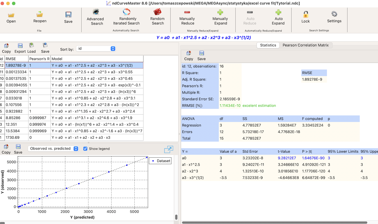
For this solution, RMSE equals 0, and Pearson's correlation coefficient is 1.
As you can see, the coefficients and exponents in the equation found by ndCurveMaster align perfectly with those employed to calculate variable Y (formula (2)).
Conclusion
Using curve fitting tools, we aimed to find the target equation (2): Y = 3 + 3 · x12.5 + 4 · x23 + (-3.5) · x31/2. While Excel delivered decent results, the table below clearly shows that only ndCurveMaster achieved 100% accuracy, significantly outperforming Excel and revealing the underlying equation (2). However, the solution from Excel is still quite impressive, especially considering it’s a DIY tool.
| Software | Discovered Equation | RMSE | Pearson Correlation Coefficient |
|---|---|---|---|
| Excel | Y = 0.89 + 3.518 * x12.65 + 1.314 * x22.11 - 0.066 * x3-4.16 | 4.38 | 0.99999715 |
| ndCurveMaster | Y = 3 + 3 · x12.5 + 4 · x23 + (-3.5) · x31/2 | 0 | 1 |